Climate change and temperature anomalies

Loading the data
weather <-
  read_csv("https://data.giss.nasa.gov/gistemp/tabledata_v4/NH.Ts+dSST.csv",
           skip = 1,
           na = "***")
## Rows: 142 Columns: 19## ── Column specification ────────────────────────────────────────────────────────
## Delimiter: ","
## dbl (19): Year, Jan, Feb, Mar, Apr, May, Jun, Jul, Aug, Sep, Oct, Nov, Dec, ...##
## ℹ Use `spec()` to retrieve the full column specification for this data.
## ℹ Specify the column types or set `show_col_types = FALSE` to quiet this message.Tidying the data using select() and pivot_longer()
tidyweather <- weather %>%
  select(1:13) %>% #Selecting Year and month variables
  pivot_longer(cols=2:13, names_to='month', values_to='delta') #Tidying the data from wide to long format so that we have a column for the months and the corresponding temperature data respectively
Checking for year, month, and delta columns in the tidyweather dataframe
skim(tidyweather)| Name | tidyweather |
| Number of rows | 1704 |
| Number of columns | 3 |
| _______________________ | |
| Column type frequency: | |
| character | 1 |
| numeric | 2 |
| ________________________ | |
| Group variables | None |
Variable type: character
| skim_variable | n_missing | complete_rate | min | max | empty | n_unique | whitespace |
|---|---|---|---|---|---|---|---|
| month | 0 | 1 | 3 | 3 | 0 | 12 | 0 |
Variable type: numeric
| skim_variable | n_missing | complete_rate | mean | sd | p0 | p25 | p50 | p75 | p100 | hist |
|---|---|---|---|---|---|---|---|---|---|---|
| Year | 0 | 1 | 1950.50 | 41.00 | 1880.00 | 1915.00 | 1950.50 | 1986.00 | 2021.00 | ▇▇▇▇▇ |
| delta | 4 | 1 | 0.08 | 0.47 | -1.52 | -0.24 | -0.01 | 0.31 | 1.94 | ▁▆▇▂▁ |
Plotting Information
#Creating date variables for the tidyweather dataset
tidyweather <- tidyweather %>%
  mutate(date = ymd(paste(as.character(Year), month, "1")), #Creating a column called date
         month = month(date, label=TRUE), #Converting month column into an ordered date factor
         year = year(date)) #Converting the Year column into an ordered date factor

#Plotting temperature by date
ggplot(tidyweather, aes(x=date, y = delta))+  #Plotting delta by date
  geom_point()+ #Scatterplot
  geom_smooth(color="red") + #Adding a red trend line
  theme_bw() + #theme
  labs (#Adding a labels
    title = "Weather Anomalies",
    x = "Date",
    y = "Delta"
  ) +
  NULL
## `geom_smooth()` using method = 'gam' and formula 'y ~ s(x, bs = "cs")'## Warning: Removed 4 rows containing non-finite values (stat_smooth).## Warning: Removed 4 rows containing missing values (geom_point).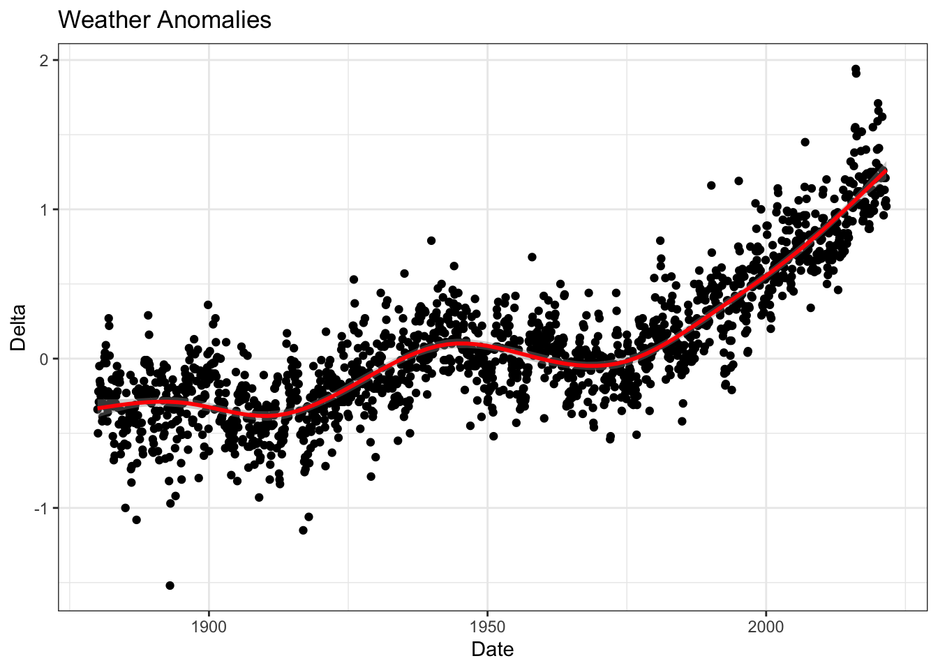
Scatterplot for each month using facet_wrap()
tidyweather %>%
  ggplot(aes(x=Year, y=delta)) + #Plotting delta by Year
  geom_point() + #Scatterplot
  geom_smooth(color="red") + #Adding a red trend line
  theme_bw() + #theme
  facet_wrap(~month) + #Creating separate graphs for each month
  labs (#Adding a labels
    title = "Weather Anomalies per Month",
    x = "Year",
    y = "Delta"
  ) +
  NULL
## `geom_smooth()` using method = 'loess' and formula 'y ~ x'## Warning: Removed 4 rows containing non-finite values (stat_smooth).## Warning: Removed 4 rows containing missing values (geom_point).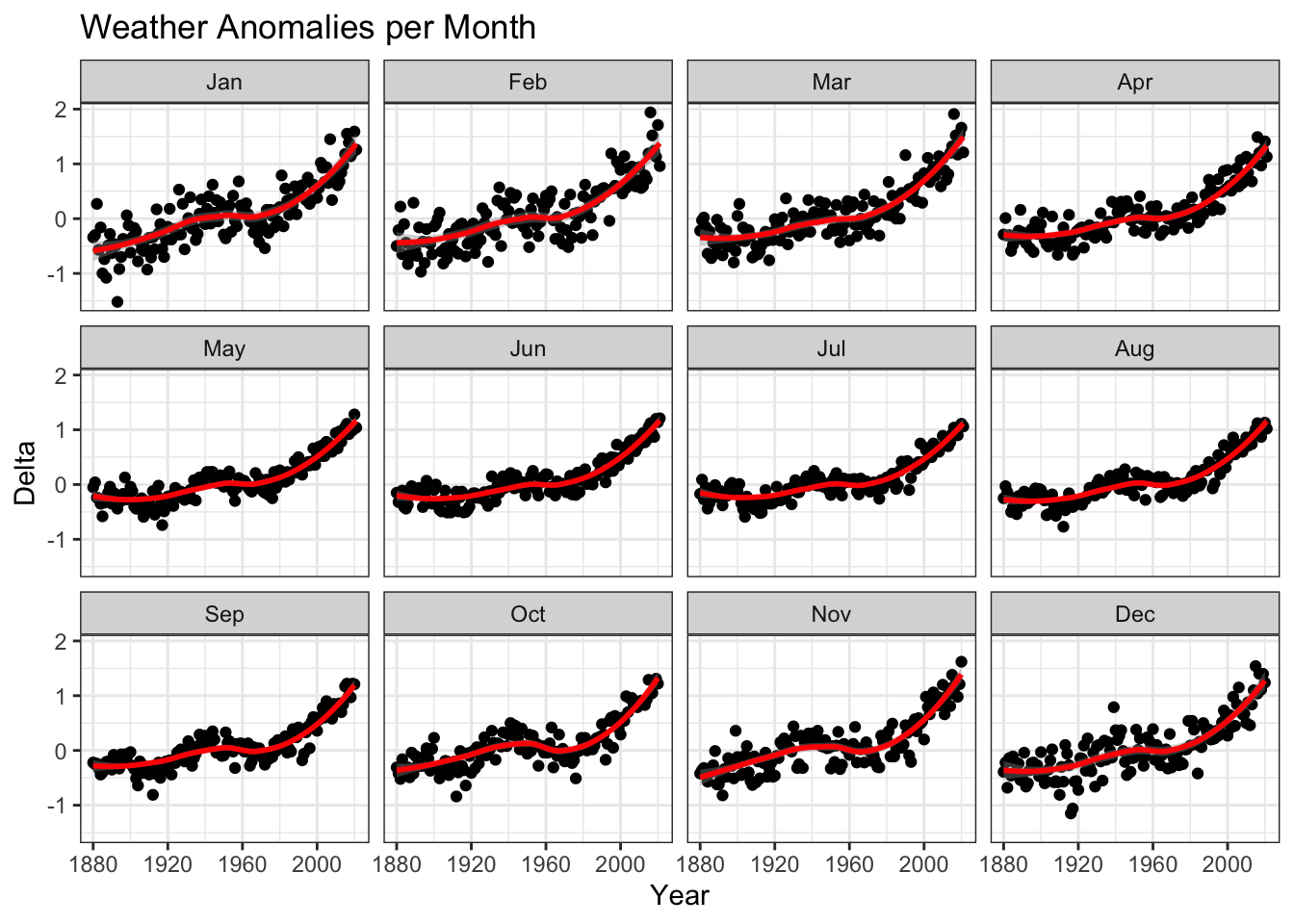
Answer below
Although all of the graphs in the grid have a similar upwards trend, there are subtle differences in variability between months such as December/January and June/July. January is a month with much higher variability in weather while June does not. This is something that may be worth looking into for meteorologists.
Creating an interval column for 1881-1920, 1921-1950, 1951-1980, 1981-2010
comparison <- tidyweather %>% #New data frame called comparison
  filter(Year>= 1881) %>%     #remove years prior to 1881
  #create new variable 'interval', and assign values based on criteria below:
  mutate(interval = case_when(
    Year %in% c(1881:1920) ~ "1881-1920",
    Year %in% c(1921:1950) ~ "1921-1950",
    Year %in% c(1951:1980) ~ "1951-1980",
    Year %in% c(1981:2010) ~ "1981-2010",
    TRUE ~ "2011-present"
  ))
Density plot to study the distribution of monthly deviations (delta), grouped by intervals we are interested in
ggplot(comparison, aes(x=delta, fill=interval)) +
  geom_density(alpha=0.2) +   #density plot with tranparency set to 20%
  theme_bw() +                #theme
  labs (
    title = "Density Plot for Monthly Temperature Anomalies",
    y     = "Density"         #changing y-axis label to sentence case
  )
## Warning: Removed 4 rows containing non-finite values (stat_density).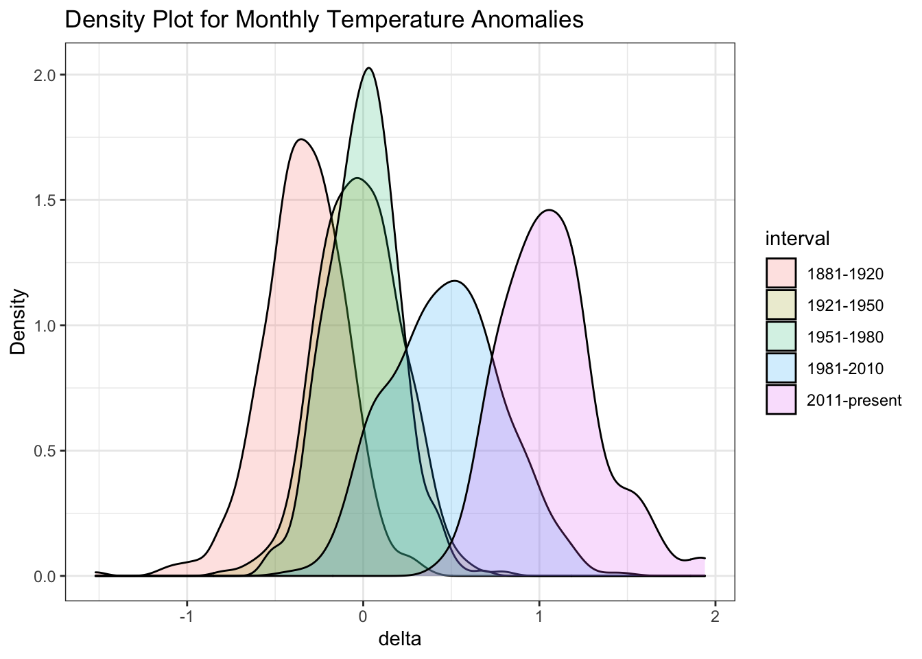
Average annual anomalies
average_annual_anomaly <- tidyweather %>%
  filter(!is.na(delta)) %>% #Removing rows with NA's in the delta column
  group_by(Year) %>%
  summarise(
    annual_average_delta=mean(delta)) #New column annual_average_delta to calculate the mean delta by year

ggplot(average_annual_anomaly, aes(x=Year, y=annual_average_delta))+
  geom_point() + #Scatterplot of annual_average_delta over the years
  geom_smooth() + #Trend line
  theme_bw() + #Theme
  labs (
    title = "Average Yearly Anomaly", #Title
    y     = "Average Annual Delta" #y-axis label
  ) +
  NULL
## `geom_smooth()` using method = 'loess' and formula 'y ~ x'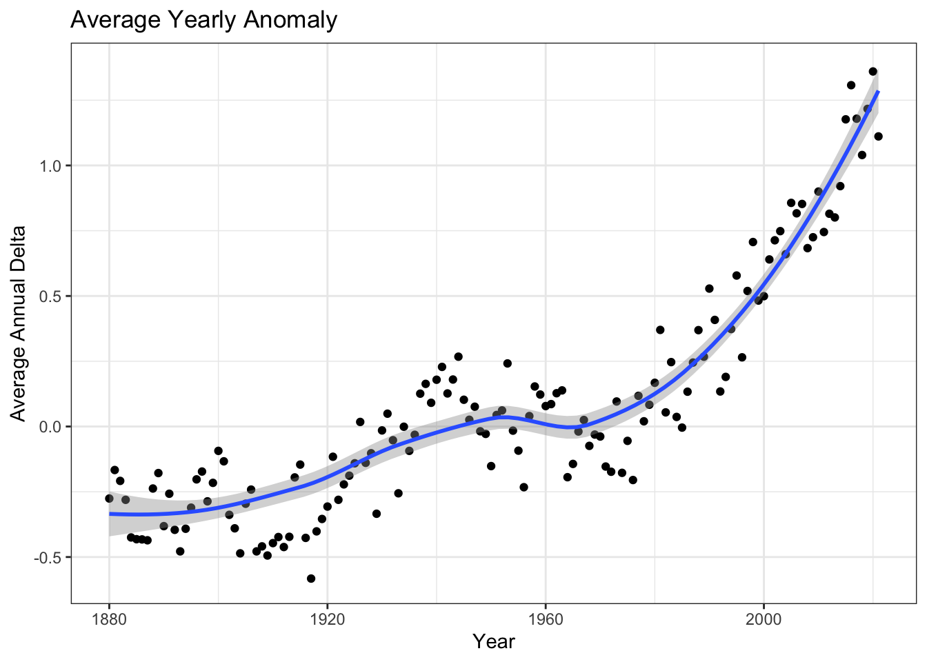
Confidence Interval for delta
NASA points out on their website that
A one-degree global change is significant because it takes a vast amount of heat to warm all the oceans, atmosphere, and land by that much. In the past, a one- to two-degree drop was all it took to plunge the Earth into the Little Ice Age.
Your task is to construct a confidence interval for the average annual delta since 2011, both using a formula and using a bootstrap simulation with the infer package. Recall that the dataframe comparison has already grouped temperature anomalies according to time intervals; we are only interested in what is happening between 2011-present.
Confidence interval for the average annual delta since 2011
formula_ci <- comparison %>%
  group_by(interval) %>%
  # calculate mean, SD, count, SE, lower/upper 95% CI
  summarise(
    mean=mean(delta, na.rm=T), #mean
    sd=sd(delta, na.rm=T), #standard deviation
    count=n(), #number of datapoints
    se=sd/sqrt(count), #standard error
    t_critical=qt(0.975, count-1), #t-critical using quantile function
    lower=mean-t_critical*se, #lower end of CI
    upper=mean+t_critical*se) %>% #upper end of CI
  # choose the interval 2011-present
  filter(interval == '2011-present')

formula_ci
## # A tibble: 1 × 8
## interval mean sd count se t_critical lower upper
## <chr> <dbl> <dbl> <int> <dbl> <dbl> <dbl> <dbl>
## 1 2011-present 1.06 0.274 132 0.0239 1.98 1.01 1.11Bootstrap Simulation
boot_ci <- comparison %>%
  group_by(interval) %>%
  filter(interval == '2011-present') %>%
  specify(response=delta) %>% #Setting delta as the response variable
  generate(reps=1000, type='bootstrap') %>% #Repeating 1000 reps
  calculate(stat='mean') %>% #Calculating mean
  get_confidence_interval(level=0.95, type='percentile') #Calculating confidence interval
## Warning: Removed 4 rows containing missing values.boot_ci## # A tibble: 1 × 2
## lower_ci upper_ci
## <dbl> <dbl>
## 1 1.01 1.11Answer below
We construct a 95% confidence interval both using the formula and a bootstrap simulation. The result shows that the true mean lies within the interval calculated with 95% confidence. The fact that this confidence interval does not contain zero shows that the difference between the means is statistically significant. Hence, using our result, we can conclude that the increase in temprature is statistically significant and that global warming is progressing.