Excess rentals in TfL bike sharing
Challenge : Excess rentals in TfL bike sharing
Load and clean the latest Tfl data
url <- "https://data.london.gov.uk/download/number-bicycle-hires/ac29363e-e0cb-47cc-a97a-e216d900a6b0/tfl-daily-cycle-hires.xlsx"

# Download TFL data to temporary file
httr::GET(url, write_disk(bike.temp <- tempfile(fileext = ".xlsx")))
## Response [https://airdrive-secure.s3-eu-west-1.amazonaws.com/london/dataset/number-bicycle-hires/2021-08-23T14%3A32%3A29/tfl-daily-cycle-hires.xlsx?X-Amz-Algorithm=AWS4-HMAC-SHA256&X-Amz-Credential=AKIAJJDIMAIVZJDICKHA%2F20210919%2Feu-west-1%2Fs3%2Faws4_request&X-Amz-Date=20210919T164008Z&X-Amz-Expires=300&X-Amz-Signature=0d8ed56990368826800faf5aefffdfceed152d188c231ca3d7458600d8b20b46&X-Amz-SignedHeaders=host]
## Date: 2021-09-19 16:41
## Status: 200
## Content-Type: application/vnd.openxmlformats-officedocument.spreadsheetml.sheet
## Size: 173 kB
## <ON DISK> /var/folders/yd/4bs2dvq14mz84cx9079s4pmh0000gn/T//RtmpzK5iWA/file20f1d371d84.xlsx# Use read_excel to read it as dataframe
bike0 <- read_excel(bike.temp,
sheet = "Data",
range = cell_cols("A:B"))
# change dates to get year, month, and week
bike <- bike0 %>%
clean_names() %>%
rename (bikes_hired = number_of_bicycle_hires) %>%
mutate (year = year(day),
month = lubridate::month(day, label = TRUE),
week = isoweek(day))Facet grid by month and year
Answer below
The grid above shows a large decrease in bike rentals in May and June 2020 compared to previous years. This huge decrease is clearly to do with COVID-19 lockdowns since people had to stay inside. We can also see that May and June have some variability year to year which most likely has to do with weather conditions in those two months (i.e. if it’s warmer in May 2018 than in May 2017, there would be more bike rentals in 2018).
Reproduce the following two graphs.
# Clean the data
bike_exp <- bike %>%
  filter(year > 2015) %>% #Filter all the data that after 2015
  group_by(month) %>%
  summarise(expected_rentals=mean(bikes_hired)) # Calculate the expected rentals

# Replicate the first graph of actual and expected rentals for each month across years
plot <- bike %>%
  filter(year > 2015) %>%
  group_by(year, month) %>%
  summarise(actual_rentals=mean(bikes_hired)) %>% # Calculate the actual mean rentals for each month
  inner_join(bike_exp, by='month') %>% # Combine the data with original dataset
  mutate(
    up=if_else(actual_rentals > expected_rentals, actual_rentals - expected_rentals, 0),
    down=if_else(actual_rentals < expected_rentals, expected_rentals - actual_rentals, 0)) %>% # Create the up and down variable for plotting the shaded area using geom_ribbon
  ggplot(aes(x=month)) +
  geom_line(aes(y=actual_rentals, group=1), size=0.1, colour='black') +
  geom_line(aes(y=expected_rentals, group=1), size=0.7, colour='blue') + # Create lines for actual and expected rentals data for each month across years
  geom_ribbon(aes(ymin=expected_rentals, ymax=expected_rentals+up, group=1), fill='#7DCD85', alpha=0.4) +
  geom_ribbon(aes(ymin=expected_rentals, ymax=expected_rentals-down, group=1), fill='#CB454A', alpha=0.4) + # Create shaded areas and fill with different colors for up and down side
  facet_wrap(~year) + # Facet the graphs by year
  theme_bw() + # Theme
  labs(title="Monthly changes in TfL bike rentals", subtitle="Change from monthly average shown in blue and calculated between 2016-2019", x="", y="Bike rentals") +
  NULL
## `summarise()` has grouped output by 'year'. You can override using the `.groups` argument.ggsave(file='bike1_plot.png', plot=plot, width=12, height=8) # Create and save the plot
plot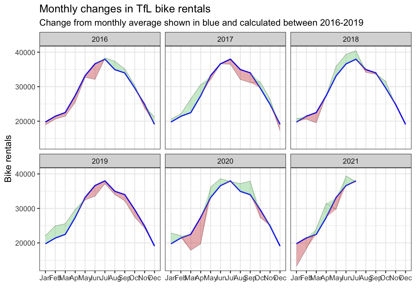
Replicate the second graph of percentage changes from the expected level of weekly rentals.
# Clean the data
bike_exp_week <- bike %>%
  filter(year > 2015) %>%
  mutate(week=if_else(month == 'Jan' & week == 53, 1, week)) %>% # Create week variable for the dataset
  group_by(week) %>%
  summarise(expected_rentals=mean(bikes_hired))

# Make the graph
plot <- bike %>%
  filter(year > 2015) %>%
  mutate(week=if_else(month == 'Jan' & week == 53, 1, week)) %>%
  group_by(year, week) %>%
  summarise(actual_rentals=mean(bikes_hired)) %>%
  inner_join(bike_exp_week, by='week') %>%
  mutate(
    actual_rentals=(actual_rentals-expected_rentals)/expected_rentals, #Calculate the excess rentals
    up=if_else(actual_rentals > 0, actual_rentals, 0),
    down=if_else(actual_rentals < 0, actual_rentals, 0), # Create the up and down variable for plotting the shaded area using geom_ribbon
    colour=if_else(up > 0, 'G', 'R')) %>% # Define the colors for up and down side
  ggplot(aes(x=week)) +
  geom_rect(aes(xmin=13, xmax=26, ymin=-Inf, ymax=Inf), alpha=0.005) +
  geom_rect(aes(xmin=39, xmax=53, ymin=-Inf, ymax=Inf), alpha=0.005) + # Add shaded grey areas for the according week ranges
  geom_line(aes(y=actual_rentals, group=1), size=0.1, colour='black') +
  geom_ribbon(aes(ymin=0, ymax=up, group=1), fill='#7DCD85', alpha=0.4) +
  geom_ribbon(aes(ymin=down, ymax=0, group=1), fill='#CB454A', alpha=0.4) + # Create shaded areas and fill with different colors for up and down
  geom_rug(aes(color=colour), sides='b') + # Plot rugs using geom_rug
  scale_colour_manual(breaks=c('G', 'R'), values=c('#7DCD85', '#CB454A')) +
  facet_wrap(~year) + # Facet by year
  theme_bw() + # Theme
  labs(title="Weekly changes in TfL bike rentals", subtitle="% change from weekly averages calculated between 2016-2019", x="week", y="") +
  NULL
## `summarise()` has grouped output by 'year'. You can override using the `.groups` argument.ggsave(file='bike2_plot.png', plot=plot, width=12, height=8) # Create and save the plot
plot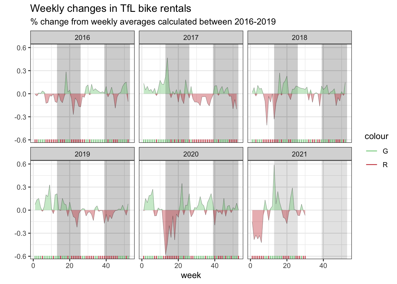
Should you use the mean or the median to calculate your expected rentals? Why? We use the mean to calculate the expected rentals.